


1
2
3
4
5
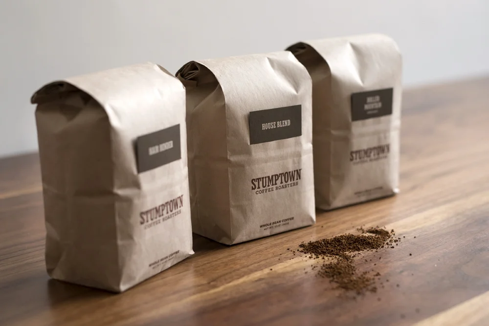
The Iconic Stumptown "brown kraft bag and coffee card" system (originally designed by OMFGCO), is one of the most recognizable and equitable packages in the world of specialty coffee. Although loved by fans and Stumptown alike, the packaging had slowly begun to show its age and lack of consistency after a very solid 6 years on grocery shelves.
Stumptown internally explored many options, from simply functionally updating bag materials to a complete overhaul of the packaging system. After much exploration and deliberation we decided the best course of action would be to modernize the existing system, upgrade to higher-end printing techniques, update the color palette for increased shelf presence and readability, and to streamline the information on the cards, in order to better inform consumers of their coffee drinking experience.
In addition to an updated color palette, card redesign, and substrate update of the bags, the "Stumptown Coffee Roasters" logo (of which there were literally over 20 versions in use) were pared down and a family of primary, secondary, and tertiary marks to provide much needed consistency.